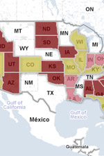
Leaning GOP? Leaning Dem? Google interactive map poll monitoring
The interactive map – coded by Google using their maps API – displays data from multiple polling outfits and allows users to quickly dig down to specific races and check out current status. As an example, you can find out if your district is Safe Dem, Likely Dem, Leans Dem, Toss Up, Leans GOP, Likely GOP, or Safe GOP.
Of course, the information output is only as good as the information input from the different polling organizations, so you can take it with a grain of salt. I’m not exactly certain who selected the poll sources, and I’m not even sure the data is any good at all. (I just like the technology.) Five sets of data – Sabato, Cook, Rothenberg, CQ-Roll Call, and RealClearPolitics – are included as options you can select.
I think it would be kind of cool to combine results from multiple polls who query from likely, registered voters with a reasonable poll sample distribution. Anybody got the time?
Hat tip to Maetenloch at Ace of Spades.
If the map is not working, head over to this page.
3 Comments

The website's content and articles were migrated to a new framework in October 2023. You may see [shortcodes in brackets] that do not make any sense. Please ignore that stuff. We may fix it at some point, but we do not have the time now.
You'll also note comments migrated over may have misplaced question marks and missing spaces. All comments were migrated, but trackbacks may not show.
The site is not broken.

I find it intriguing that RI and MA are "undecided".
Another very good site is: http://www.electoral-vote.com/index.htm. This site pretty much nailed the 2008 outcome.
Sorry, site should be: http://www.electoral-vote.com