Analysis: Distribution of stimulus funds to states
On Sunday, Fox News reporter John Lott actually did some analysis on the distribution of federal stimulus funds to all 50 states and found states hit hardest by the recession have received the least amount of stimulus cash. It’s not a sexy story since it includes scatter plots and trend lines, but it’s worth a review.
From Fox News…
The stimulus bill “includes help for those hardest hit by our economic crisis,” President Obama promised when he signed the bill into law on Feb. 17. “As a whole, this plan will help poor and working Americans.”
But FOXNews.com has analyzed data tracking how the stimulus money is being given out across the 50 states and the District of Columbia, and it has found a perverse pattern: the states hardest hit by the recession received the least money. States with higher bankruptcy, foreclosure and unemployment rates got less money. And higher income states received more.
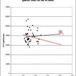
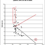
[Note: Any red indicators (lines, circles, squares and dots) added to the scatter plots were done so by the author to help the reader understand the graphs. If I made it worse, let me know in the comments and I will try to clarify. Click on the graphics to see them full size.]
Lott first takes a loot at stimulus dollars as compared to per capita income. Click on the first chart to enlarge, but the trend line indicates states with a higher per capita income in the fourth quarter of 2008 received more stimulus dollars per capita.
If you’re a politician, you want your state’s dot to be in the upper right portion of the chart, which means the state has a high per capita income but still got plenty of stimulus dollars. The trend line (black) indicates federal funds generally go towards higher income states.
If President Obama wanted federal funds to go to states with lower incomes, the trend line would head down (red line added by me) and more dots would show up on the lower right portion of the chart.
I’m wondering which state (dot) is marked in red with a B. They have a higher than average per capita income but got a great amount of stimulus dollars.
Next, we take a look at unemployment rates. Obama promised the federal stimulus dollars would go to those hardest hit by the recession, but the actual fact is the states (represented by black dots) that have a relatively low unemployment rate are getting plenty of funding as compared to states with high unemployment rates.
The trend line should slope up as I have indicated in red, but it slopes down (black line) indicating states with lower unemployment rates are getting a larger share of federal dollars.
The three states within the red circle have very low unemployment rates. [Full employment is considered 4.7 percent, and these states are under 4.7 percent.] If your state dot is farther to the right, you’re getting more funding. What state is represented by the dot highlighted B?
Next, Lot at Fox News takes a look at the bankruptcy rates. Again, the trend line should be going up, but the black lines steep slope indicates states with lower bankruptcy rates are getting a much higher proportion of the federal cash. (This analysis has displays the most extreme sloping line.)
The three states (black dots) noted by the A box have very high bankruptcy rates but are on the left side of the graph, where they should be closer to the right side of the graph.
Again, you have to ask the question about the state circled in red in the lower right portion of the graph. With a very low bankruptcy rate of about 1 percent, it has/will receive a huge amount of stimulus dollars per capita!
The last chart also has a pretty steep line, and the foreclosure analysis continues to show the overall trend of states in better shape getting more stimulus dollars.
Again, you would expect the trend line (in black) to slope up indicating the states with a higher foreclosure percentage getting more funding, but that is not the case.
You’ve got to wonder about state A, since it has the highest foreclosure rate, but is not getting near the amount of federal stimulus dollars state B is getting. Who is state B? All I know is state B has one of the lowest foreclosure rates in the country and getting plenty of federal slush fund cash.
For those of you counting the dots, Lott notes…
Two comments should be raised about the figures. Alaska has by far the highest stimulus spending per capita of any state, more than twice the second highest state, Arizona ($808). But its higher amount may at least partially reflect the state’s much higher cost of living. In any case, given that it is such an outlier, the charts were redone excluding Alaska. Doing that, the results for bankruptcies, foreclosures, and unemployment indicate that the states with the worst problems got even less money than shown in the charts provided here. While states with higher incomes also still got more money, the relationship was no longer statistically significant. Finally, the charts were redone with the most recent data available for these measures of economic hardship, and the results were very similar.
Lott continues… (do please read the full article on FoxNews.com)
An Obama administration official told FOXNews.com that “it is not as simple as looking where the money goes. You could have someone who lives in Maryland and works in Virginia and they are benefited from money given to the Virginia firm even though they live in Maryland.” She also noted that it didn’t really matter who got the money because “giving out money is good for everyone. If you give the money to an old person, they will spend it and that will create more jobs.”
She also said that Congress was responsible for deciding where the money would go. “We didn’t write the bill. We let Congress write the bill,” she said.
Lee Ohanian, an economics professor at UCLA who has extensively studied New Deal policies and depressions, told FOXNews.com that the spending patterns our study found “certainly don’t fit what you would think that they would be from the standpoint of government spending as a social safety net…. The pattern does seem quite odd. It is certainly not the way the program was advertised.”
Hot Air mentioned this report yesterday, but the reporting has not gotten much play in the conservative blogosphere so spread the word!
5 Comments
The website's content and articles were migrated to a new framework in October 2023. You may see [shortcodes in brackets] that do not make any sense. Please ignore that stuff. We may fix it at some point, but we do not have the time now.
You'll also note comments migrated over may have misplaced question marks and missing spaces. All comments were migrated, but trackbacks may not show.
The site is not broken.


Sorry, but I am confused. How does the data from end of 2008, early 2009, get mixed in w/ (scant) data from 2009 (stimulus was passed in Feb). Didn't all the per capita data change from end of 2008 into 2009?
From the article… "Finally, the charts were redone with the most recent data available for these measures of economic hardship, and the results were very similar."
I would assume they used the most current data and information concerning bankruptcy, income, foreclosures and unemployment numbers come out at different times.
@Steve- Then why not use the most recent data instead of having to say:"I would assume they ……". You lose cred this way.
I'm sorry all of the data points are not released on the exact same day. You'll have to deal with it, and no, I have not lost any cred.
Good analysis, seeing this chats I assume that president Obama and his team is taking the right decisions to take us out of this crisis.
Good blog, by the way!!! 😉
Take a look at mine if you want to see informations about foreclosures: http://www.foreclosurelistings.com